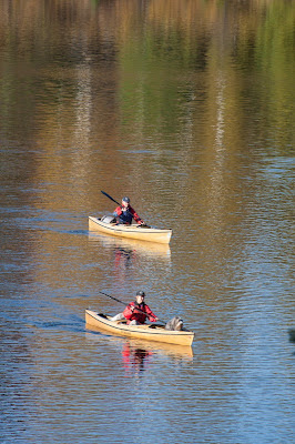
We're asking your opinion on some shots we'd like to use for catalog covers next fall season.
You can visit the Online Catalog Here.
You are invited to comment on the blog comment section below this entry and vote for your favorites.
Your comments will be published the following day or after the weekend (so you are aware of why they don't appear right away). Thank you and enjoy! Let us know what you think.
 |
| Fall Cover Option #1 Click to view Larger Version |
 |
| Fall Cover Option #2 Click to view Larger Version |
 |
| Fall Cover Option #3 Click to view Larger Version |
 |
| Fall Cover Option #4 Click to view Larger Version |
 |
| Fall Cover Option #5 Click to view Larger Version |
 |
| Fall Cover Option #6 Click to view Larger Version |


24 comments:
I prefer #1.
I like them all. #1 or #4 show off the fall foliage best I think. Are they carrying canaks?
They are carrying Canaks from Wenonah Canoe. Thank you for your votes!
I like #1 and #3.
#1 or #4. I like the close ups the best; they are more striking.
I like #1 the best.
#1 or #4
gatobin said:
# 1 shows the best fall foliage
# 6 is second if you want close up of the people. :)
My vote is for # 3. it has great color contrast,good symmetry with the paddlers and
the paddle position.
4 or 6 for me
#1 looks to be the best.
I vote for #3. There is colour in the trees, and the people are NOT recognizable, which I think can detract from a picture.
thanks!!!
#3 for me; more water and trees, less people
#1 or #6
#1 has very pleasing color, framing and composition
#4 is my choice but they're all great photos
#1 best captures the essense of fall and has a good flow of light areas near the top to dark areas near the bottom of the image. Judicious use of photo editing software to bring the faces out of the shadows by slightly lightening them would be an improvement. #4 actually has better exposure than #1 but the composition is less balanced and the dogs are running amok. #2 is a good second choice (after #1): the composition is good and it is the most striking image. Its weakness is that it does not feel particularly autumnal. #3 has too much of a strong horizontal line right through the middle of it, largely due to the light colored log at the edge of water on the right side. Cropping the bottom to fit the aspect ratio of a catalog will cause other problems with overall balance.
Photo #1 says it all.It best shows off the people and gear. the colors are spectacular. the dogs compliment the photo rather than being too much in the fore front.
I like #3 for the same reasons Nan gave.
Ken Sloan-Couch prefers # 6. Just makes me want to join them. Even the dog seems to be enjoying the outing. Excited and joyous, thrilled to be out with friends.
I think #1 epitomizes the feel of being with family, pets, and nature in Autumn. Just the joy of BEING is seen in this picture - animals and humans! I miss Fall colors! Here we go from Summer to Winter in one fell swoop! Wish I lived in Ely.
#1!! Reminds me of an old Life Magazine cover photo!
C.W. Cain
#4 Appeals to me the most.
Oct. 14th
picture #1 - two people, two canoes, two dogs! I didn't really expect to see a picture with cats.
Post a Comment